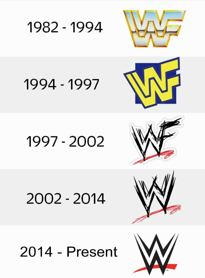
Okay, so I’ve been wanting to mess around with recreating that classic WWE “scratch” logo for a while now. You know, the one from the Attitude Era? It just screams nostalgia, and I figured it would be a fun little design project. I’m no professional, just doing this for kicks, so bear with me.
First, I started by grabbing a bunch of reference images. I just googled “WWE scratch logo” and saved a few that looked clear enough to work from. I wanted to get a good sense of the shape and the little details.
Then, I opened up my trusty old image editing software. It’s nothing fancy, just something I’ve been using for years. I created a new, fairly large canvas. It’s always easier to work big and then shrink it down later, right?
Next, I began by roughly sketching out the basic shape of the “W”. I didn’t stress about perfection at this stage, I just wanted to get the general proportions down. I did this a couple of times, erasing and redrawing until I had something that felt about right.
- Drew the first “W” freehand, kinda shaky.
- Erased it. It looked more like a messed-up “M”.
- Tried again, focusing on making the lines more jagged and aggressive. Better!
Once I had the first “W”, I pretty much repeated the process for the second one. I paid extra attention to making sure they were roughly the same size and had that same “scratched” look. It’s all about those uneven edges, you know?
After the two “W”s were in place, I tackled the “F” (which used to be there, for the World Wrestling Federation). This was actually a bit trickier than I expected. I had to make it look like it was integrated with the “W”s, but also slightly separate. I played around with layering and overlapping until it looked halfway decent.

Adding the “Scratch” Details
Now for the fun part – making it actually look “scratched”! This involved a lot of just…scribbling, really. I picked a smaller brush size and started adding random, jagged lines within the letters. I tried to make them look like actual scratches, going in different directions and varying the pressure.
I also added some “splatter” effects around the edges of the letters. I wanted it to look a bit rough and worn, like it had been through a few wrestling matches itself. A few extra lines here, some more jagged edges there. I kept referencing my saved images to keep it looking authentic.
Finally, I played around with the colors. I know the classic logo is usually just black on white, but I experimented with some different shades of gray, and even a very subtle red outline, just to see how it looked. I ended up sticking with the classic black and white, though. Sometimes the original is best!
It’s not perfect, and a real designer could probably do a much better job, but I’m pretty happy with how it turned out. It was a fun little project, and it definitely brought back some memories of watching wrestling as a kid. It just about making it, and enjoy the proccess.


